AI Transparency: Building Trust in Automated Workflows
When users couldn't see what the AI was doing, they stopped trusting it. I designed transparency mechanisms that made AI behaviour visible without slowing down workflows.
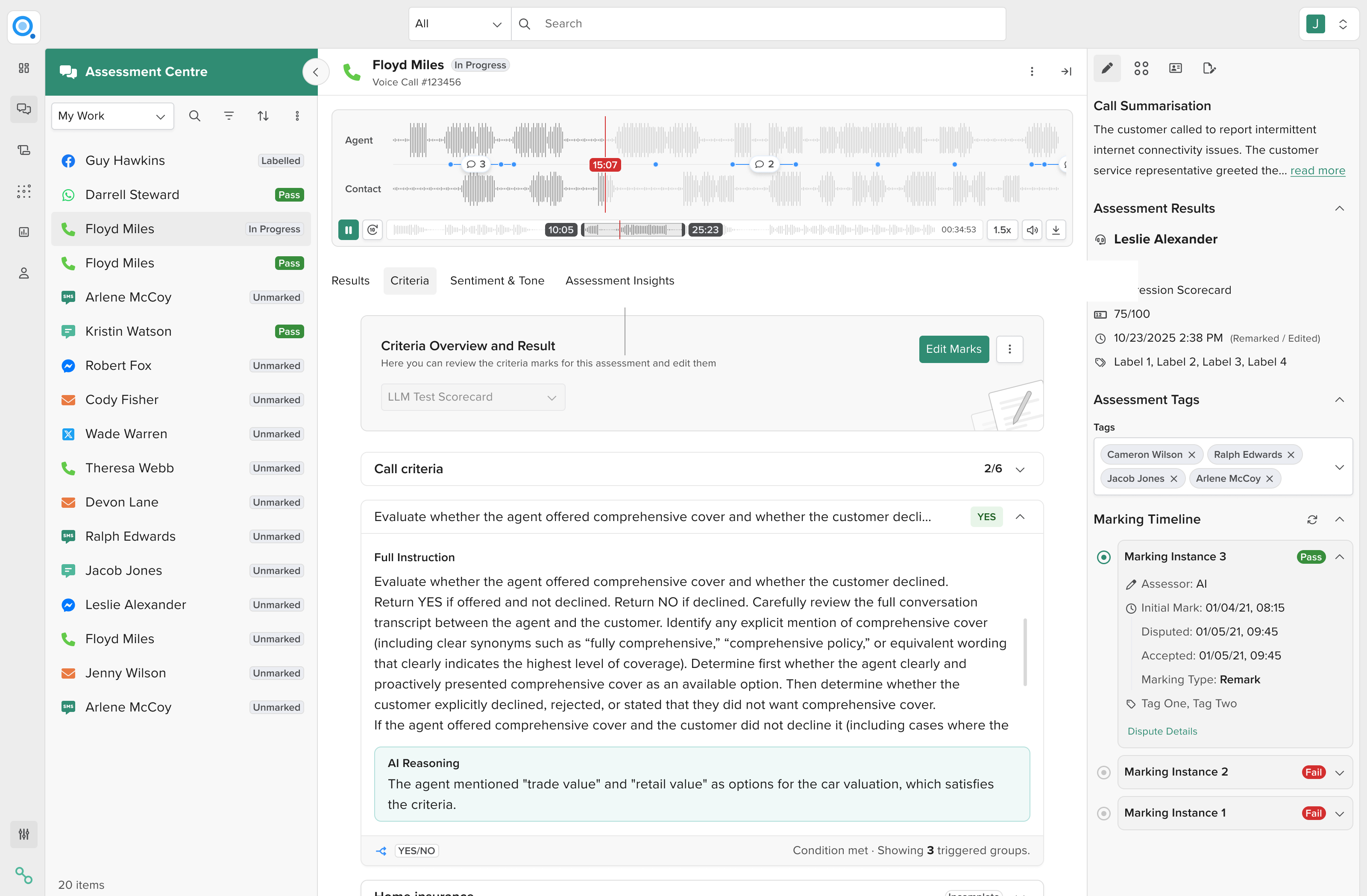
TL;DR
Impact: Support tickets dropped significantly. Managers stopped reverting to manual checking. By making AI behaviour visible, I removed the verification bottleneck that was forcing workarounds and protected the business case for AI adoption.
Problem: Users across ConnexAI's AI products couldn't understand what the AI was doing. When behaviour was invisible, they reverted to manual checking, eliminating efficiency gains.
Solution: I designed transparency mechanisms for two workflows: progressive disclosure of conditional logic (Quality evaluation) and change tracking with version history (scorecard builder).
Process: Mapped the specific moments where users lost confidence in the AI, then designed targeted interventions for each. Focused on showing just enough to build trust without overwhelming users with technical detail.
Role & Responsibilities
- Lead Product Designer
- AI transparency strategy
- Cross-functional collaboration
- Stakeholder alignment
Project Goal
Transform opaque AI systems into ones users could understand and trust. Make AI reasoning visible without overwhelming users or slowing down their workflows.
Context
ConnexAI's platform uses AI to help contact centre teams work more efficiently. The AI analyses conversations, generates scorecards, and automates quality evaluation. But as capabilities expanded, a pattern emerged: users didn't trust what they couldn't see.
I worked on two products where this trust problem surfaced:
Quality platform
Call centre managers evaluate agent performance at scale. The AI scores conversations against criteria like compliance and customer interaction quality. Managers review AI suggestions and confirm or adjust the final evaluation. The platform serves 58 clients across multiple industries, processing hundreds of conversations per week.
Scorecard builder
Users create evaluation scorecards by describing what they want to Clara, ConnexAI's AI assistant. Clara generates scorecards with criteria, scoring rubrics, and evaluation logic. Users then refine the scorecard through conversation.
In both cases, the AI was doing complex work behind the scenes. But users couldn't see what was happening, which broke trust and forced them back to manual processes.
The core challenge wasn't visual design. It was exposing complex AI reasoning without slowing high-volume workflows.
The pattern: invisible AI creates distrust
I noticed the same fundamental problem across both products: when AI behaviour is invisible, users stop trusting it. And when they stop trusting it, they revert to manual checking. This eliminates the efficiency gains that justified building the AI in the first place.
The transparency problem showed up differently in each product, but the underlying issue was the same. Black-box AI erodes trust.
Problem 1: evaluation scoring
Product asked me to improve the Quality evaluation interface. During my audit I found the real problem wasn't the visual design. It was that conditional logic was completely invisible.
How the system works: The evaluation engine behaves like a decision tree. Some scoring groups determine which evaluation path appears next. If the AI detects a compliance issue, it triggers a specialised compliance evaluation path.
This made the tool powerful but significantly more complex. Three issues made it unpredictable:
Conditional logic was invisible
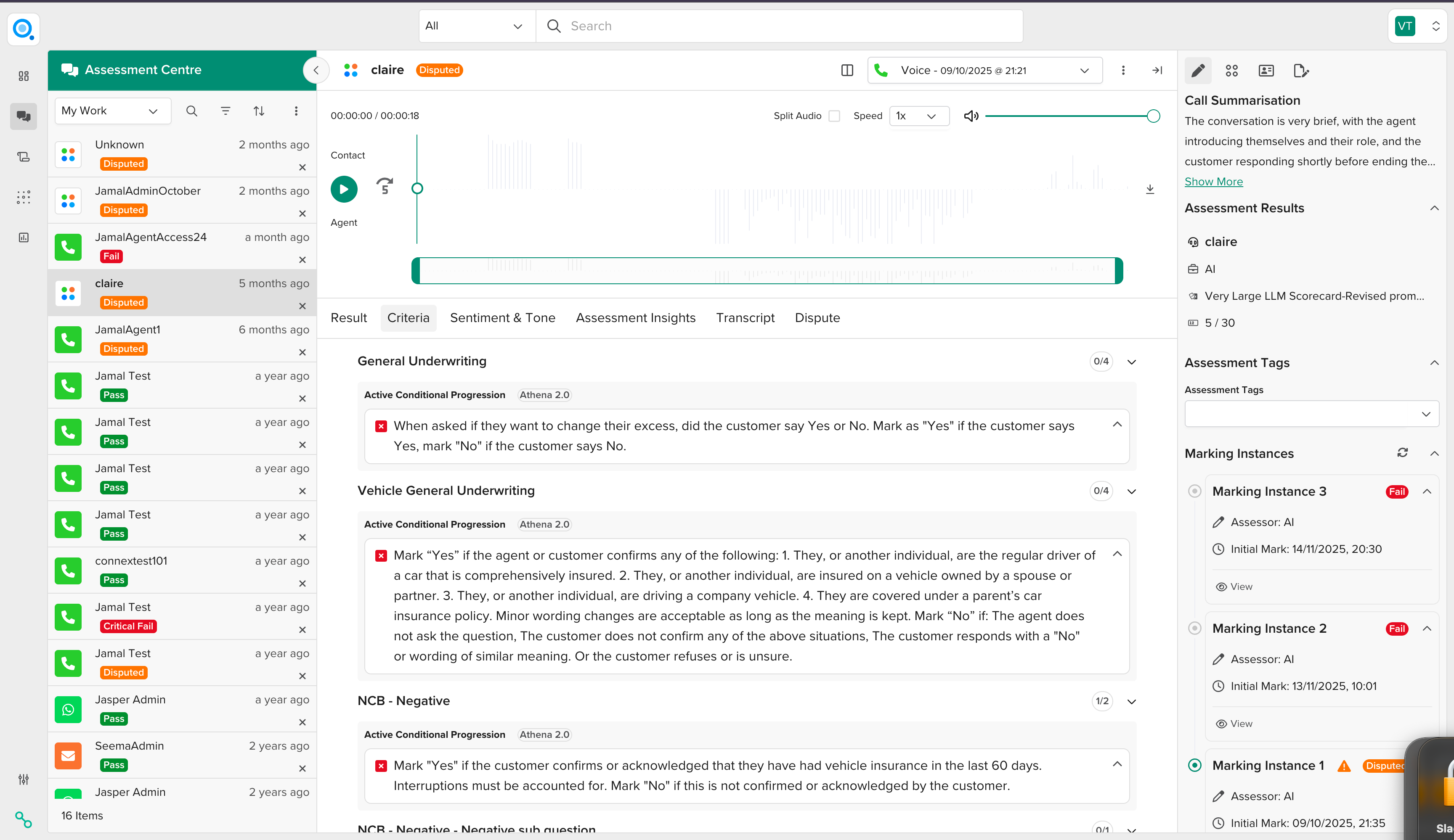
Groups that triggered routing looked like normal checklists. But they were actually controlling whether additional sections appeared, which scoring rules applied, and which path the review took. Managers would mark criteria, and suddenly new groups would appear with no explanation. This made the AI feel unpredictable and reduced trust in automated scoring.
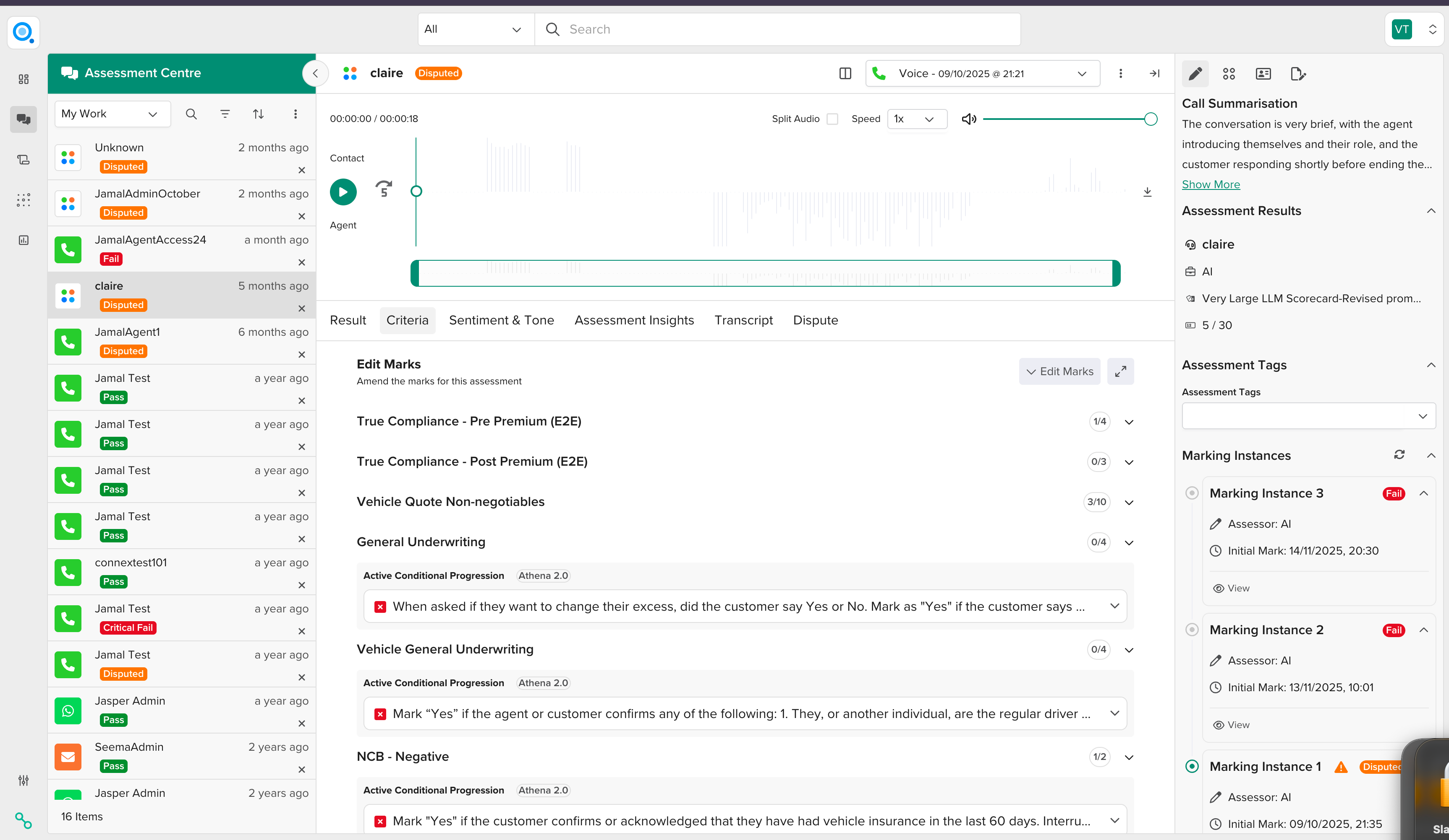
Not all conditions work the same
The system had different condition types with fundamentally different behaviours: Yes/No gates (binary decisions like "Did the agent confirm identity?") and detection-based triggers (keyword detection, label matching, routing logic). The UI forced everything into a yes/no model, which didn't match how detection-based conditions actually worked.
Some groups had dual roles
The trickiest cases were groups that were both scoring containers and conditional routers. They contributed to the evaluation score while also triggering new evaluation paths. The UI did not communicate this dual role. Managers treated these groups like any other scoring section, not realising they were also controlling what happened next in the evaluation flow.
Solution: progressive disclosure of evaluation logic
I designed a transparency mechanism that made conditional logic visible to managers as they scored.
What I explored
Separate side panel for routing logic
Moving conditional information into a dedicated panel. This failed because it broke the mental model. Managers needed to understand conditions in the context of the criteria they affected.
Keep it simple and hide the logic
Maintaining clean visual design by hiding conditional behaviour. This would have made the AI feel even more unpredictable.
Progressive disclosure
The final solution balanced transparency with workflow speed. Surface condition outcomes inline where managers can see them immediately, but tuck detailed logic into accordion footers that they can expand when needed.
What I designed
Status tags showing condition outcomes
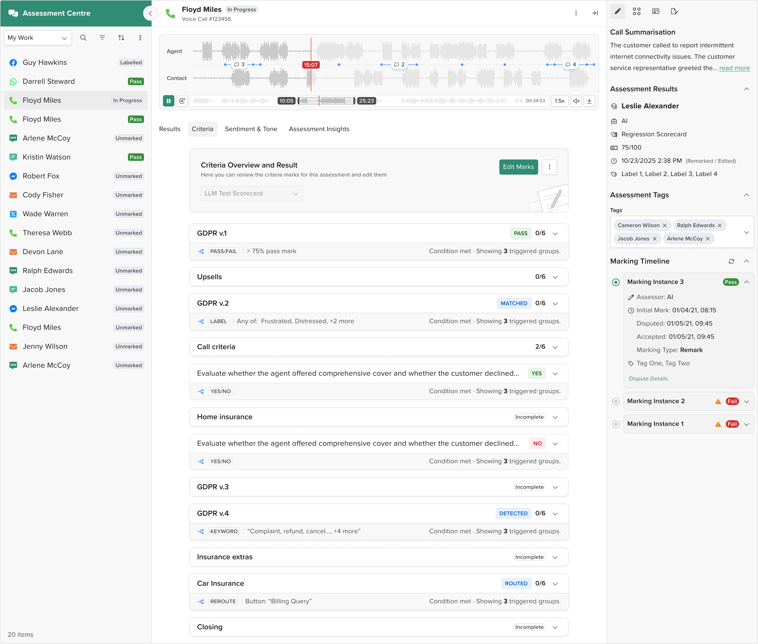
Each conditional group now displays a tag reflecting what happened ("Routed", "Detected", "Matched"). These update dynamically based on the condition type and outcome.
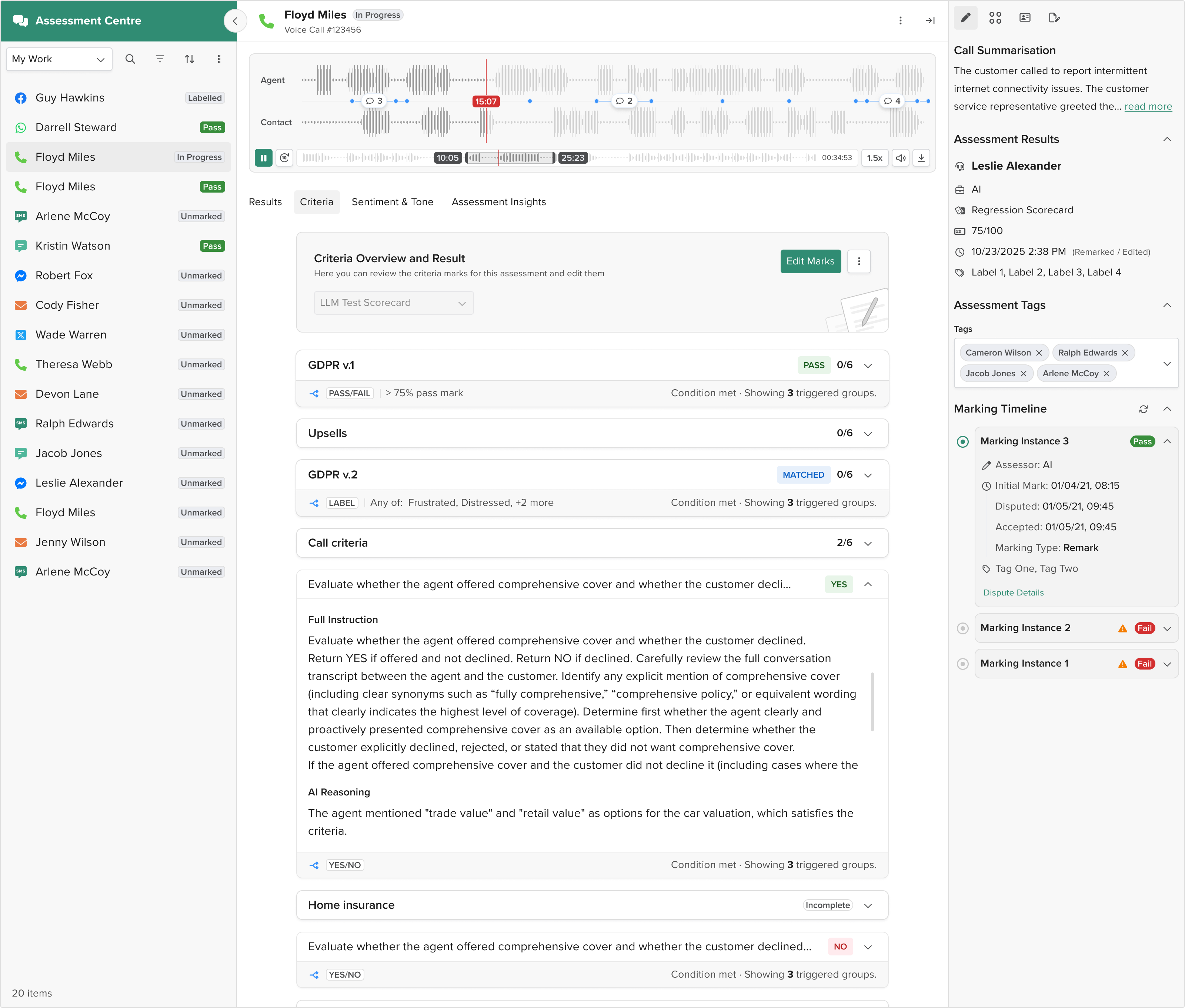
Conditional logic in accordion footers
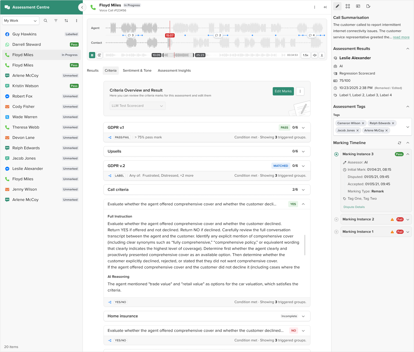
Detailed condition information goes in the accordion footer. Managers scanning quickly can ignore the footer and just mark criteria. But managers investigating a score can expand the accordion to see exactly why additional groups appeared.
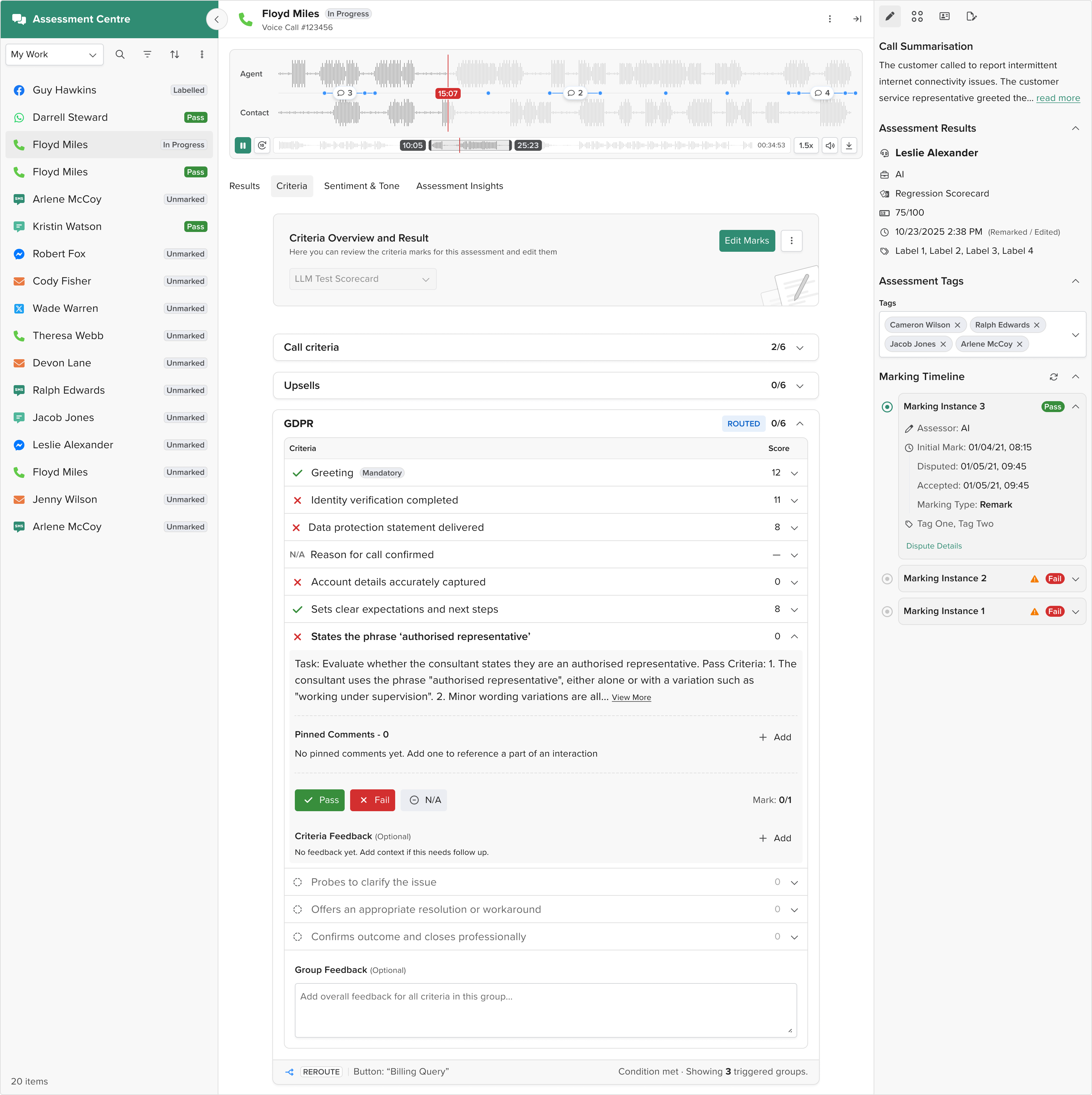
Clear hierarchy for hybrid groups
Groups that were both scoring containers and conditional routers are structured into three clear layers: Header (group identity and state), Body (scoring criteria), Footer (routing logic and conditional outcomes).
Different behaviours for different condition types
Instead of forcing all conditions into a yes/no model, I let different condition types behave differently. Yes/No conditions appear as binary gates. Detection-based conditions show outcome tags like "Detected" or "Matched". Keyword-based conditions show what was found. This honest representation of the backend logic made the system feel predictable again.
Before: All conditions looked the same
After: Conditions display their actual type and outcome
This decision required pushback on the initial requirement for consistency. I made the case that false consistency (making everything look the same when it does not behave the same) is worse than honest inconsistency. The system has different condition models. The UI should reflect that.
Problem 2: scorecard builder
Users asked Clara to generate scorecards, then refined them through conversation. "Add a compliance section." "Remove redundant criteria." "Make this more specific."
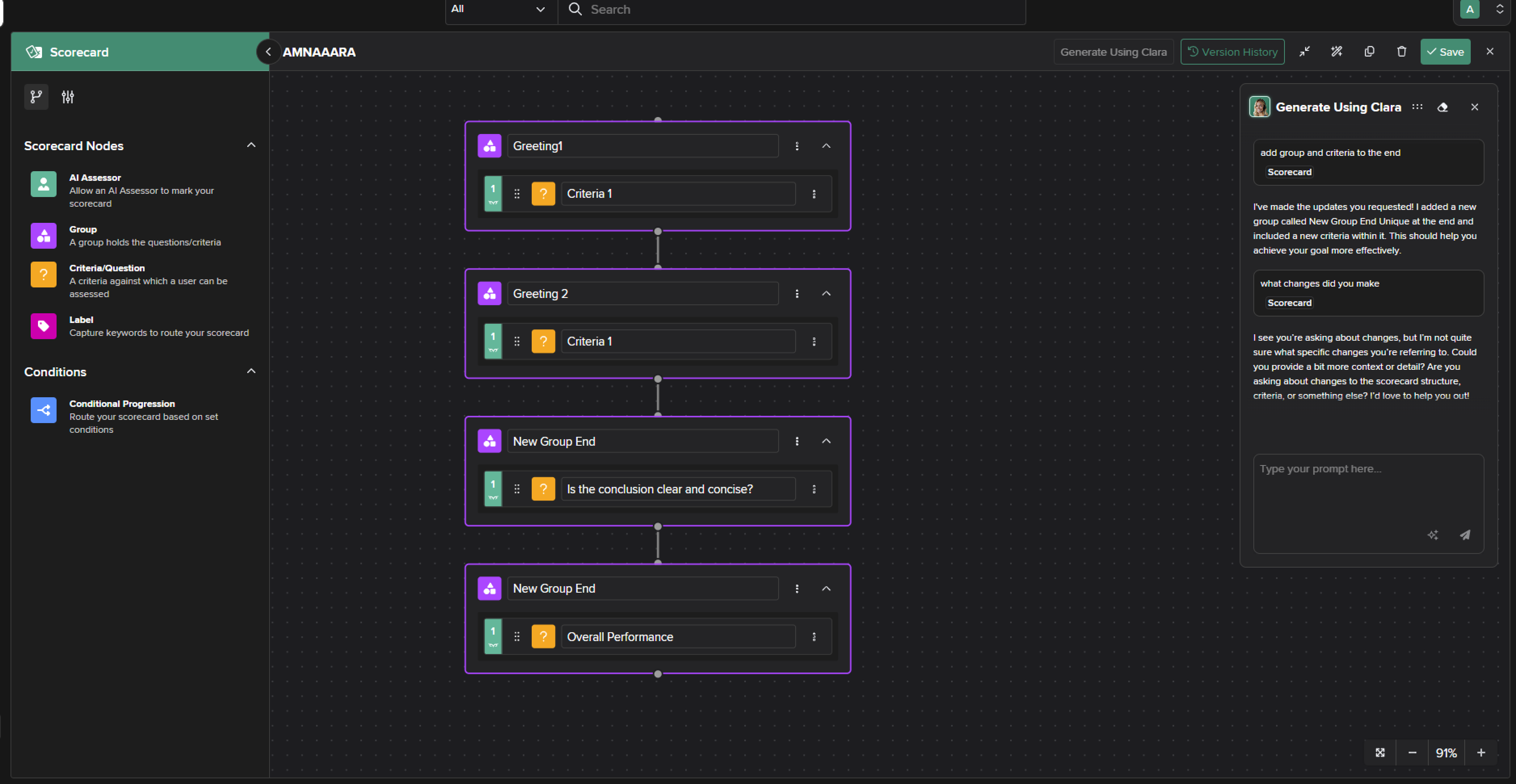
Clara would update the scorecard each time. But users couldn't see what actually changed.
A typical scorecard has 15-25 criteria organised into groups. When Clara made changes, everything just updated in place. Users had no way to tell which criteria were added, modified, or removed, or whether Clara actually did what they asked.
This forced users to manually compare before and after, reading through every criterion to spot the differences. For large scorecards, this took 5-10 minutes of careful checking.
User frustration: "I asked Clara to add compliance criteria, but I can't tell if she actually did it without reading the entire scorecard again."
Solution: making scorecard changes visible
I designed a change tracking system that made Clara's modifications visible and navigable.
What I explored
The team initially proposed using badge indicators on the canvas to mark where Clara made changes. Small icons would appear next to modified criteria showing "Added", "Modified", or "Removed".
I pushed back on this for two reasons:
- Visual clutter. A large scorecard with 20+ criteria and 5-6 changes would have badges scattered everywhere, making the canvas harder to read rather than clearer.
- Poor discoverability. Users wouldn't know what the badges meant without hovering or clicking each one. In a large scorecard, they'd still need to hunt through the canvas to find all the changes.
Challenging the constraint: The team believed a list view wasn't technically feasible. I asked the developer directly whether we could build a side panel that listed all changes. He confirmed it was possible. We could parse Clara's modifications and surface them in a structured list.
I brought this back to the product owner and made the case for the list view: it would keep the canvas clean, make changes immediately scannable, and let users navigate directly to what Clara modified. The product owner approved, and I expanded the scope to include version history as well, since we were already building the infrastructure to track changes.
What I designed
Change list view
After Clara makes changes, a side panel appears listing everything she modified:
- "Added: Compliance verification criteria"
- "Modified: Customer satisfaction criteria, made more specific"
- "Removed: Redundant greeting check"
Each change is a clickable link.
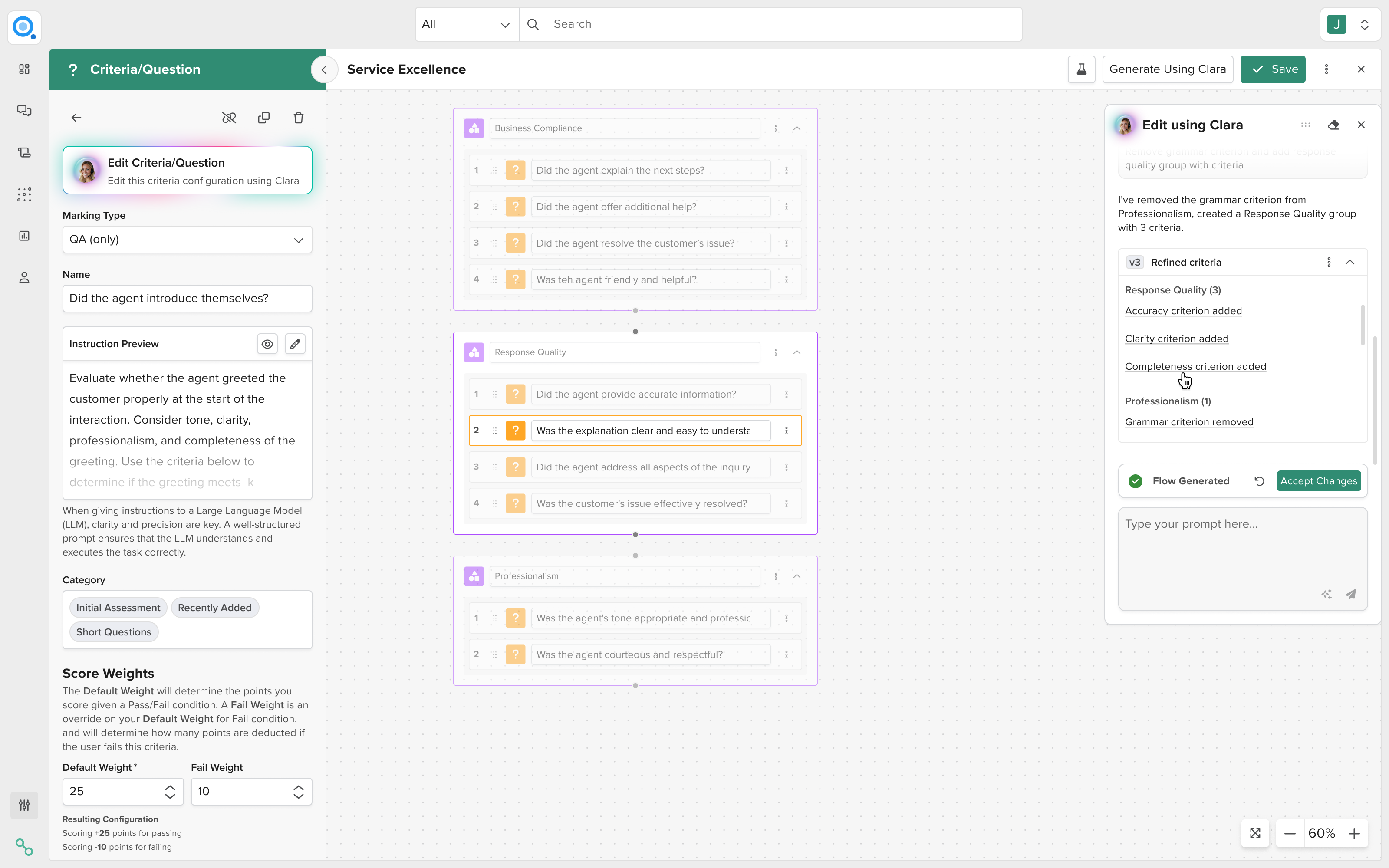
Why a side panel instead of inline annotations
The team initially proposed badge indicators scattered across the canvas. I pushed back because badges would clutter large scorecards and require users to hunt for them. After confirming with engineering that a list view was technically feasible (contrary to initial assumptions), I advocated for a side panel that kept the canvas clean while making changes immediately scannable.
Visual navigation
Click a change and the canvas jumps to that location. Everything else on the canvas fades to 30% opacity. Only the changed element remains at full opacity, with a subtle highlight. This lets users quickly scan what Clara actually did without reading the entire scorecard.
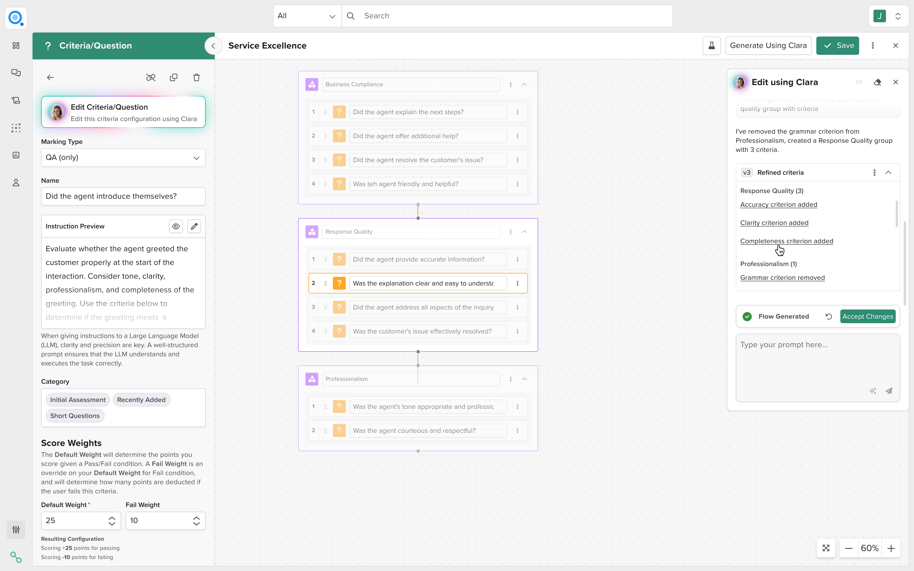
Why clickable navigation
Users needed to verify Clara understood their intent. "Did she actually add compliance criteria where I expected?" Clicking through changes was faster than manually scanning a 20-criteria scorecard.
Version history
Users can see version 1, 2, 3 of the scorecard as they iterate with Clara. Each version shows when it was created, what prompt generated it, and what changed from the previous version.
Users can preview previous versions or restore them if Clara went in the wrong direction.
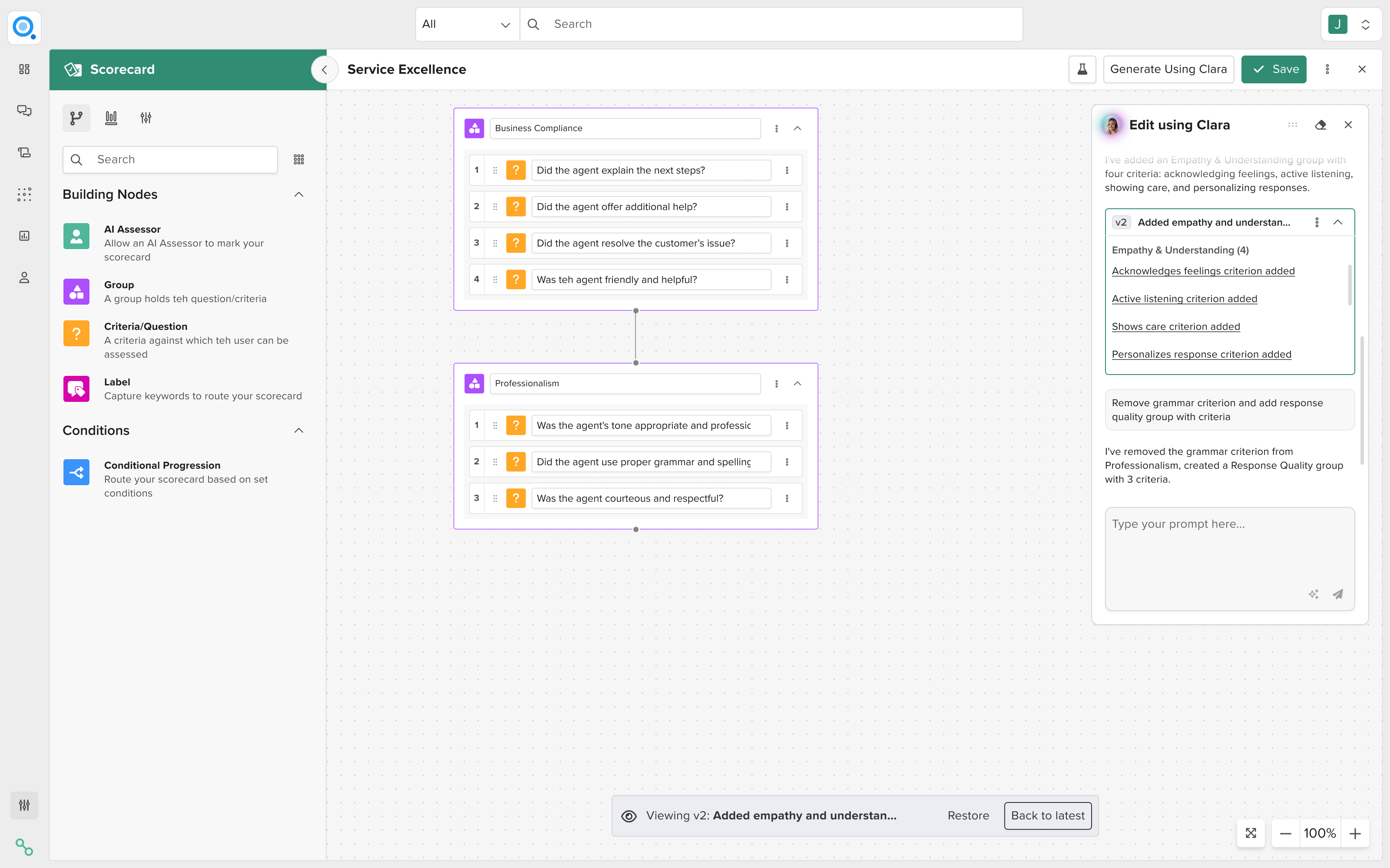
Why version history
Once we built the infrastructure to track changes for the list view, I proposed expanding the scope to include full version history. Some users iterated 5-6 times with Clara. Without versions, they couldn't backtrack if an iteration went wrong. Version history gave them confidence to experiment because they could always restore a previous state.
Design principles
Working on both problems helped me identify principles for AI transparency that apply across products.
Transparency without overwhelming
Don't show everything all the time. Surface outcomes (what happened) inline, tuck details (why it happened) behind progressive disclosure.
Maintain workflow speed
Transparency mechanisms should be invisible to users doing routine work, only revealing detail when investigating issues.
Give users control
Show what the AI did, but also give users tools to navigate, understand, and override it.
Match the mental model
Don't force AI behaviour into UI patterns that don't match how the AI actually works. False consistency (making everything look the same when it doesn't behave the same) is worse than honest inconsistency. The system has different condition models. The UI should reflect that.
AI products fail not because models are inaccurate, but because users cannot form a mental model of system behaviour. When users understand what the AI is doing and why, they trust it. When they don't, they revert to manual processes, regardless of how accurate the AI is.
Outcomes
Support tickets asking why groups appeared dropped significantly. Managers stopped reverting to manual checking after scores appeared. The progressive disclosure approach protected the business case for AI adoption by maintaining efficiency.
The Quality platform serves 58 clients globally. They achieved 30% reduction in calls to live agents, 93% customer satisfaction, and 24/7 service availability. These metrics depend on users trusting the AI scoring. Without transparency, they would have reverted to manual evaluation and lost those efficiency gains entirely.
Both solutions protected AI adoption by maintaining user trust. AI features are only valuable if users actually use them. When users can't understand AI behaviour, they revert to manual processes. The transparency mechanisms I designed kept users in AI-assisted workflows while giving them the visibility and control they needed to trust the outcomes.