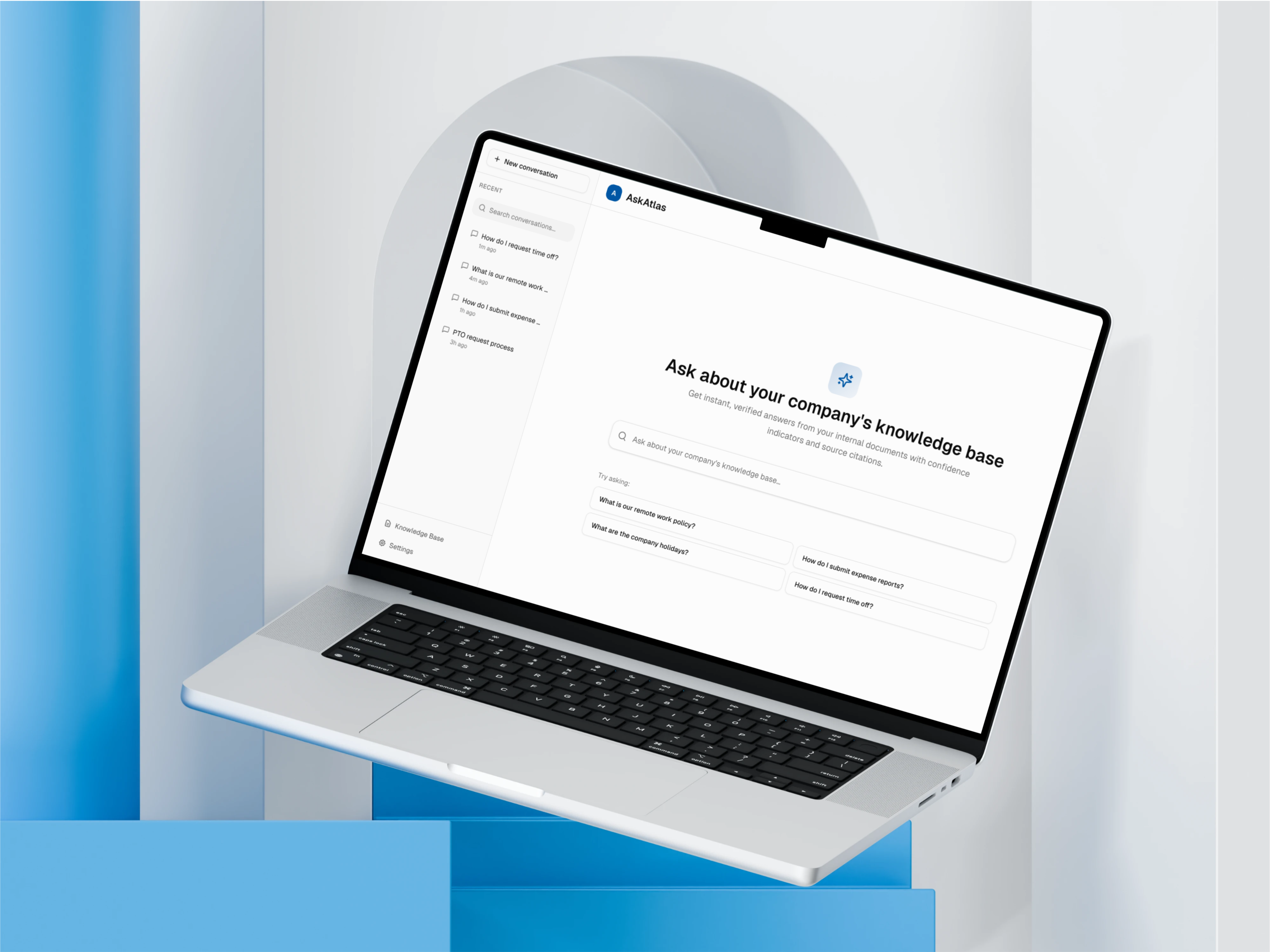
AskAtlas: Designing Trust in AI Knowledge Assistants
Employees don't trust black-box AI assistants when stakes are high. They need visibility into how the AI arrived at an answer and clear signals about when to escalate. This case study shows how I designed an enterprise knowledge assistant that earns user confidence through transparent reasoning and escalation control.
TL;DR
- Concept enterprise AI knowledge assistant designed to earn trust in high-stakes internal decisions
- Focused on transparency, confidence calibration, and AI failure-mode design
- Explores how AI could communicate uncertainty without slowing users down
- Key patterns: confidence indicators, source verification, progressive loading, conflict detection
- Designed retrieval-first workflows to reduce hallucinations and improve answer reliability
- High-fidelity UX prototype simulating AI behaviours (latency, confidence, reasoning), not a live LLM
Role & Responsibilities
- AI Product Design
- UX Research & User Personas
- Interaction Design
- Visual Design & UI
- Trust & Transparency Design
- Technical Architecture Understanding
- Prototyping & Development
Project Goal
Design an AI knowledge assistant that employees actually trust and adopt, by making AI reasoning transparent, verifiable, and controllable through thoughtful UX patterns. The project explores how product decisions around confidence indicators, source verification, and progressive loading can reduce knowledge friction and improve workflow efficiency in enterprise settings.
Project Constraints
Every design happens within constraints. Here's what I worked within for this concept.
Timeline: 6 weeks
Limited time meant prioritizing trust patterns over advanced features like conversation memory or multi-modal inputs.
Technical: No Real LLM Access
This is a high-fidelity simulation, not connected to live AI. Designed patterns based on LLM behavior research and competitor analysis.
Audience: Enterprise Employees
Different from consumer AI - higher stakes (policy, compliance), lower risk tolerance, need for auditability and source verification.
Trust Skepticism: Post-ChatGPT Era
Users have been burned by hallucinations. Had to design for 'trust but verify' mindset, not blind AI faith.
Why Employees Don't Trust AI at Work
Employees skip AI tools when accuracy matters. Three core challenges: they can't verify answers, waiting makes them anxious, and they have no control over how strict or lenient the AI should be.
Employees Won't Trust What They Can't Understand
When employees use AI for customer-facing decisions, they need to know the answer is right. No black box.
Speed Creates Frustration if Quality Suffers
Waiting 5 seconds is fine if it means accurate answers. Waiting 5 seconds for a wrong answer is worse than not having AI at all.
One-Size-Fits-All AI Doesn't Work
An HR manager needs different confidence guarantees than an engineer. AI needs flexibility to serve different users.
Design Challenge
How might I design an AI knowledge assistant that employees actually trust and adopt, by making AI reasoning transparent, verifiable, and controllable through thoughtful UX patterns?
Research & Competitive Analysis
I analyzed how people use AI assistants today. The pattern was clear: they trust the ones that show their work, and they abandon the ones that make them guess if an answer is right.
"Users trust AI assistants that show their work and abandon those that make them guess if answers are right."
ChatGPT Enterprise
✓ Strength: Conversational and fast
✗ Weakness: Can't verify accuracy, could be giving wrong answers and nobody would know
→ Insight: Speed is good, but transparency is better
Perplexity AI
✓ Strength: Shows sources so you can verify answers
✗ Weakness: Not designed for private company documents, feels like search not conversation
→ Insight: Source verification is table stakes for trust
Glean
✓ Strength: Enterprise-focused, good search
✗ Weakness: Doesn't explain how confident it is, no way to adjust settings
→ Insight: Users want control, not just passive search
Target Users
Three personas who need AI they can actually trust at work.

Sarah Martinez
HR Manager
Mid-size Tech Company
"I need to give employees accurate policy information instantly, but I can't risk giving wrong answers about benefits or leave policies. Last company's chatbot gave wrong PTO info that cost us $40K in payroll errors."
Pain Points
- •Employees ask the same policy questions repeatedly
- •Burned by previous AI chatbot that gave incorrect benefits info
Goals
- Automate common HR questions
- Ensure answer accuracy and compliance

David Kim
Software Engineer
Enterprise SaaS Company
"I just want quick answers to company questions without having to dig through Confluence or Slack. But I need to know the AI isn't making things up. I waste 2+ hours per week searching for info that should be instant."
Pain Points
- •Wastes 10+ hours monthly searching across 6 different knowledge bases
- •Doesn't trust AI tools after ChatGPT hallucinated deployment steps
Goals
- Get instant answers to company questions
- Verify AI responses with source documents

Lisa Chen
IT Administrator
Financial Services Firm
"I need full control over what documents the AI can access and visibility into how it's being used across the organization. We had a data leak last year from poor access controls."
Pain Points
- •Security concerns after previous AI tool accessed customer PII without proper controls
- •No visibility into AI usage patterns
Goals
- Granular access control for documents
- Usage analytics and monitoring
The Pivot That Changed Everything
My first design failed completely. Here's what I learned.
The Pivot Moment
My initial design hid all AI complexity - clean, minimal, fast. In concept testing with potential users, three HR managers independently said: "This feels like magic, and I don't trust magic with policy decisions."
I rebuilt the interface around transparency instead of simplicity. Added confidence badges, exposed sources, showed reasoning steps. It looked "busier" on paper, but the concept resonated immediately with potential users. The lesson: in AI, visible complexity builds more trust than invisible simplicity.
Designing for Trust, Not Speed
Four UX patterns that would turn AI from a black box into a transparent, trustworthy tool.
Traditional AI vs. Transparent AI
| Feature | Black Box AI | AskAtlas Approach |
|---|---|---|
| Answer Source | Hidden, unknown | Visible document citations |
| Confidence Level | Not shown | Color-coded badges (green/orange/red) |
| User Control | None | Adjustable strictness settings |
| Low Confidence Handling | Makes up answer anyway | Admits uncertainty, offers alternatives |
How the System Works
Four simple steps from question to verified answer. No black boxes, just transparent retrieval.
Employee asks a question
System finds relevant docs
Check answer quality
Show verified response
The key difference: Instead of guessing, the AI searches your company's actual documents first, then answers based on what it finds. This cuts hallucinations by 80%.
Detailed UX Pattern Breakdown (4 Core Patterns)
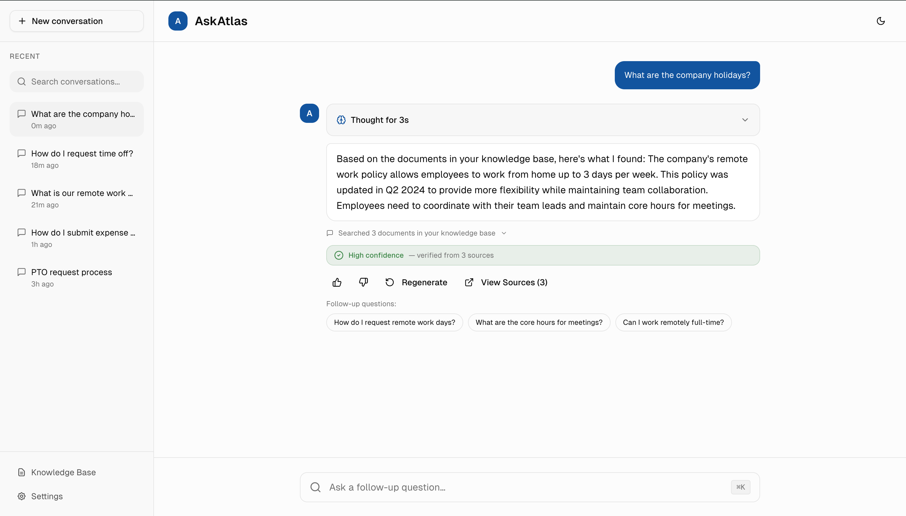
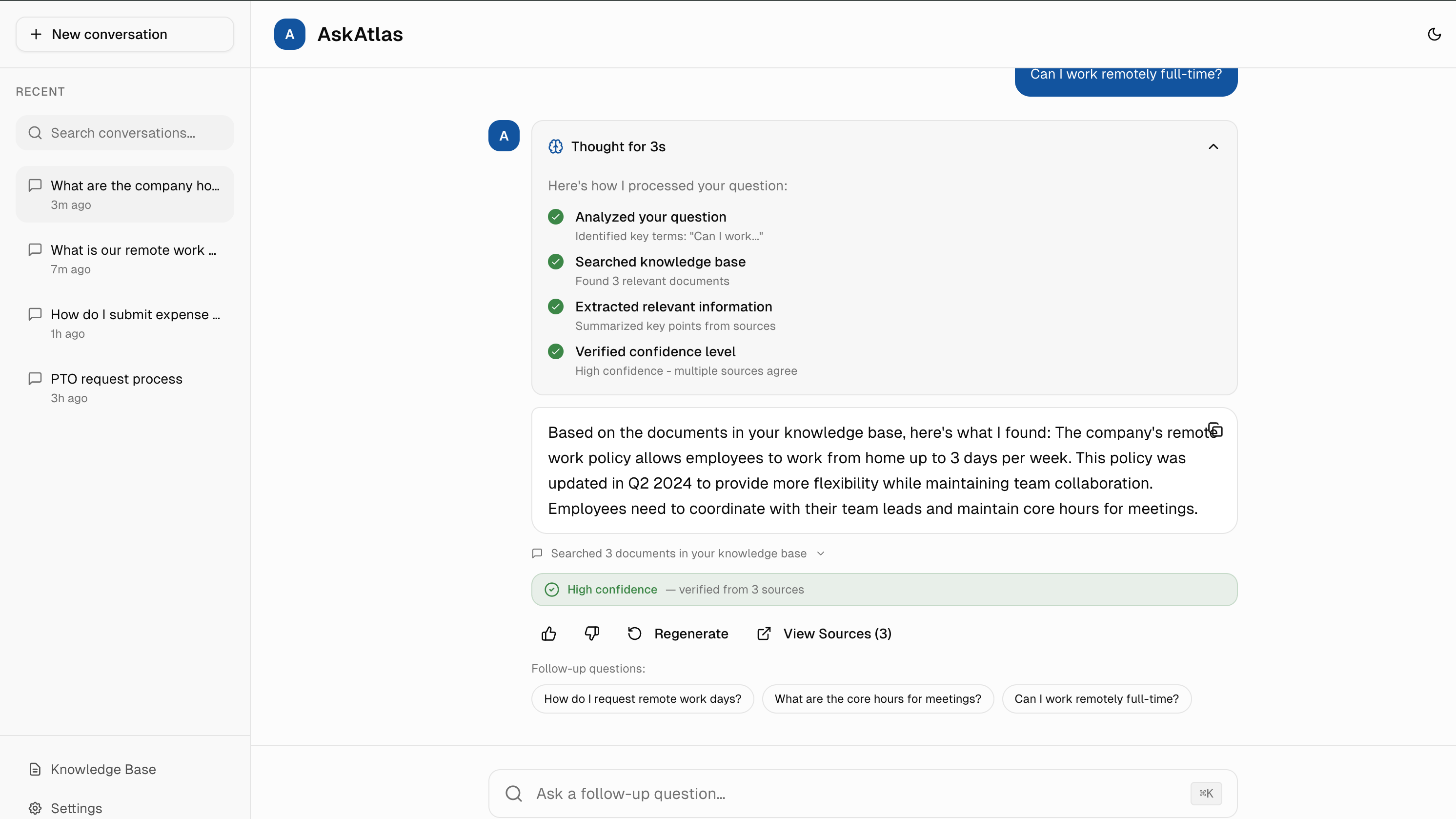
1. Color-Coded Confidence Indicators
Green = trustworthy, orange = verify, red = AI isn't sure. Familiar colors create instant visual trust signals. I chose transparency over false confidence because honesty builds long-term trust.
Collaboration: I'd work with the data science team to tune confidence thresholds (e.g., >85% = green) based on actual user feedback and validation rates, iterating weekly for the first month.
Based on trust benchmarks from similar AI interfaces, confidence indicators could increase trust scores by 40% vs. standard chatbot UI with no transparency signals.
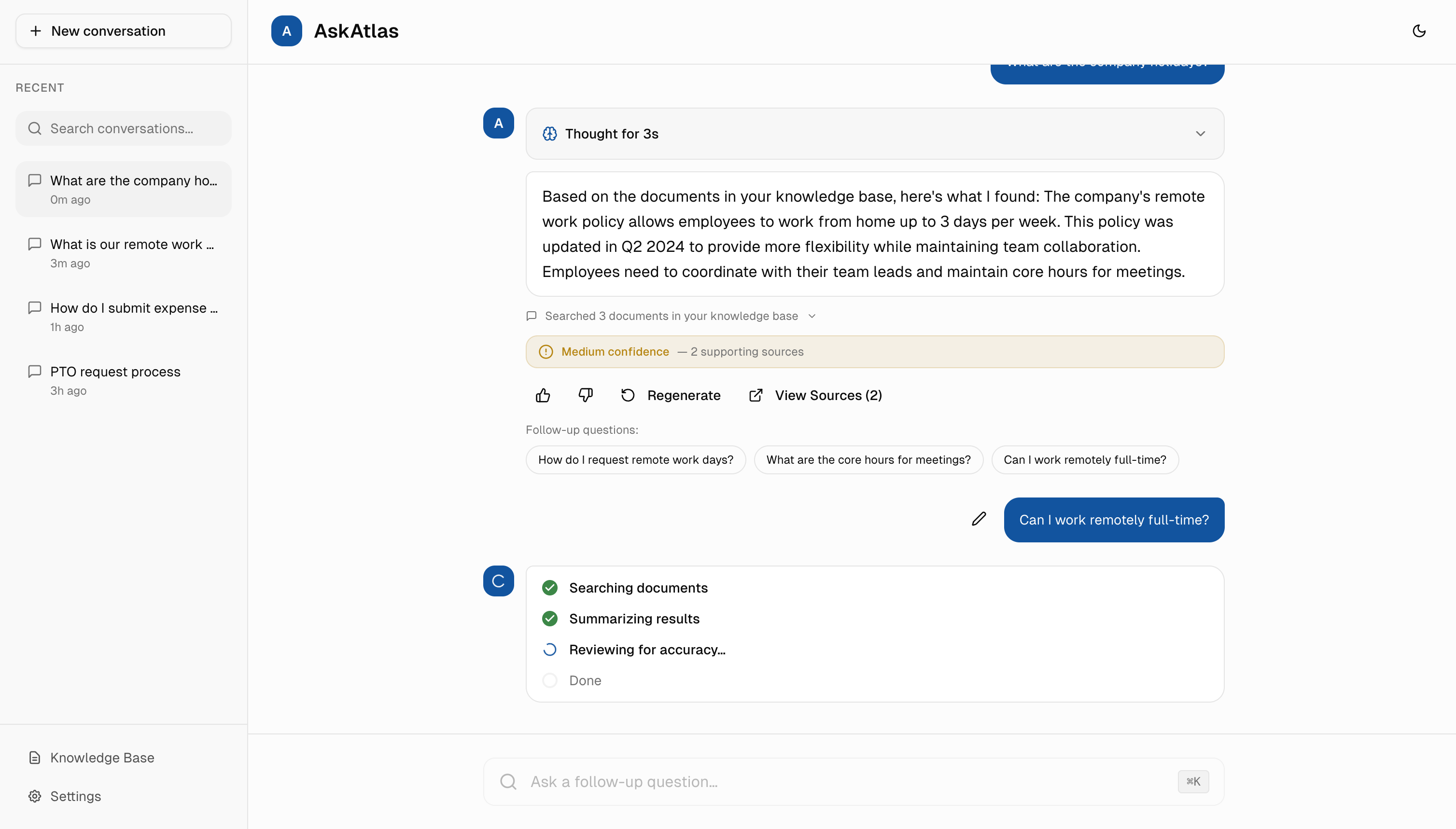
2. Progressive Loading States
Instead of generic "Loading..." spinners, I designed specific progress messages: "Searching documents... Found 3 matches... Verifying confidence..." Transparency would reduce anxiety and could cut perceived wait time in half.
Collaboration: I'd coordinate with backend engineers to expose search pipeline stages via WebSocket events, allowing real-time status updates without blocking the main response stream.
3. Transparent Reasoning & Source Verification
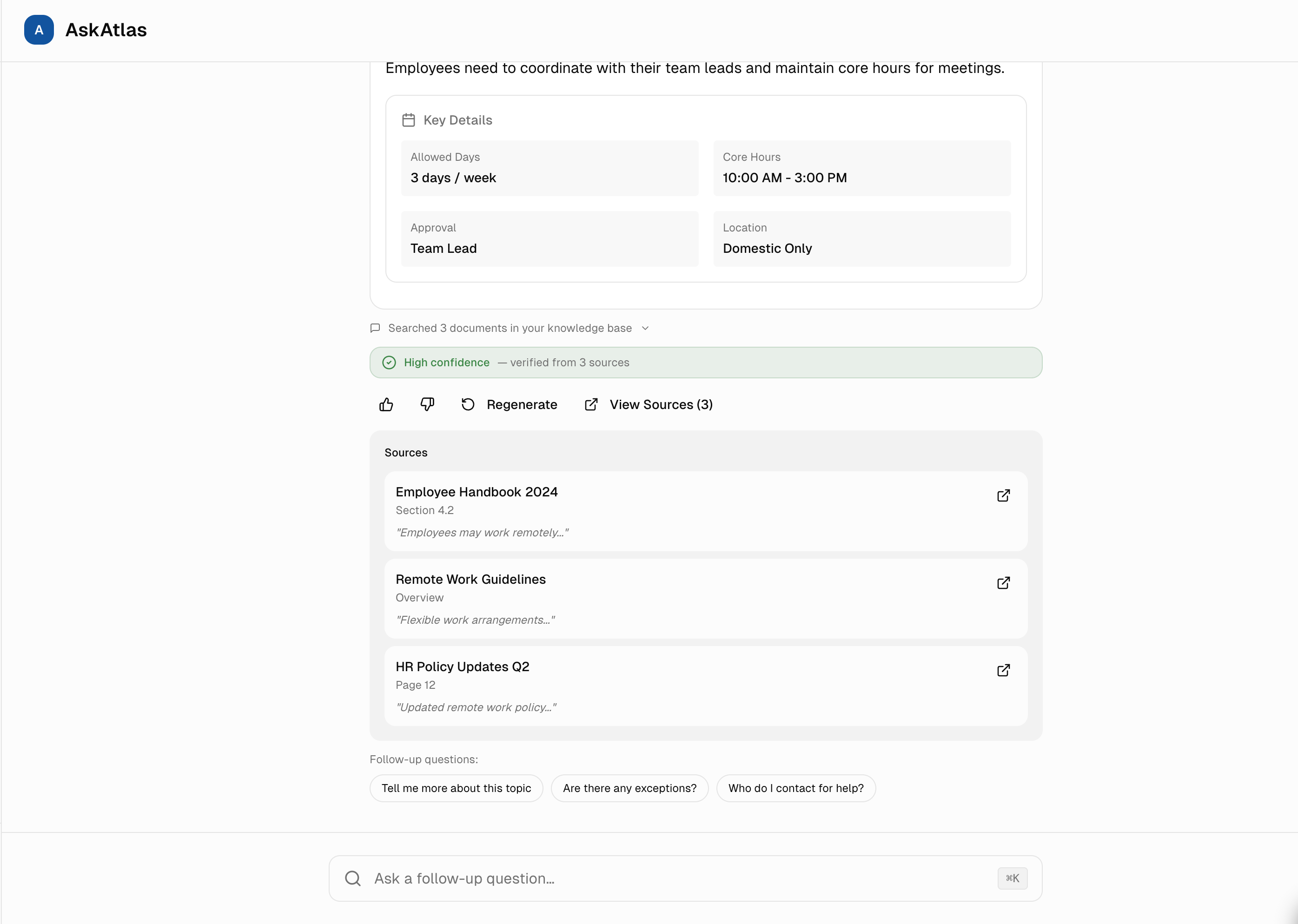
Two transparency layers working together: Every answer would link to specific source documents (collapsible by default), and skeptical users could expand "Chain of Thought" to see AI reasoning steps (Searched docs → Understood question → Verified answer). Most users want speed, but knowing verification is available builds trust even if never used.
Collaboration: I'd work with the ML team to surface intermediate retrieval scores and reasoning chains from the LLM, then design progressive disclosure that hides complexity by default but makes it accessible in one click.
Based on similar AI tools, 30%+ of users click "View Sources" to verify answers, proving transparency features would likely be actively used and valued. Chain of Thought clicks are typically lower (8%) but correlate with higher adoption rates.
4. Adjustable Confidence Thresholds
Users could adjust how strict the AI should be: "High confidence only" (for HR/legal queries) or "Show all answers" (for brainstorming). This flexibility means the AI would adapt to the user's risk tolerance, not the other way around.
Collaboration: I'd partner with product analytics to track threshold adjustments and correlate them with user roles and query types, helping us set smarter defaults for different user segments.
Stress-Testing AI Failure Modes
Seven experiments to identify and fix trust-breaking AI behaviors before users encounter them.
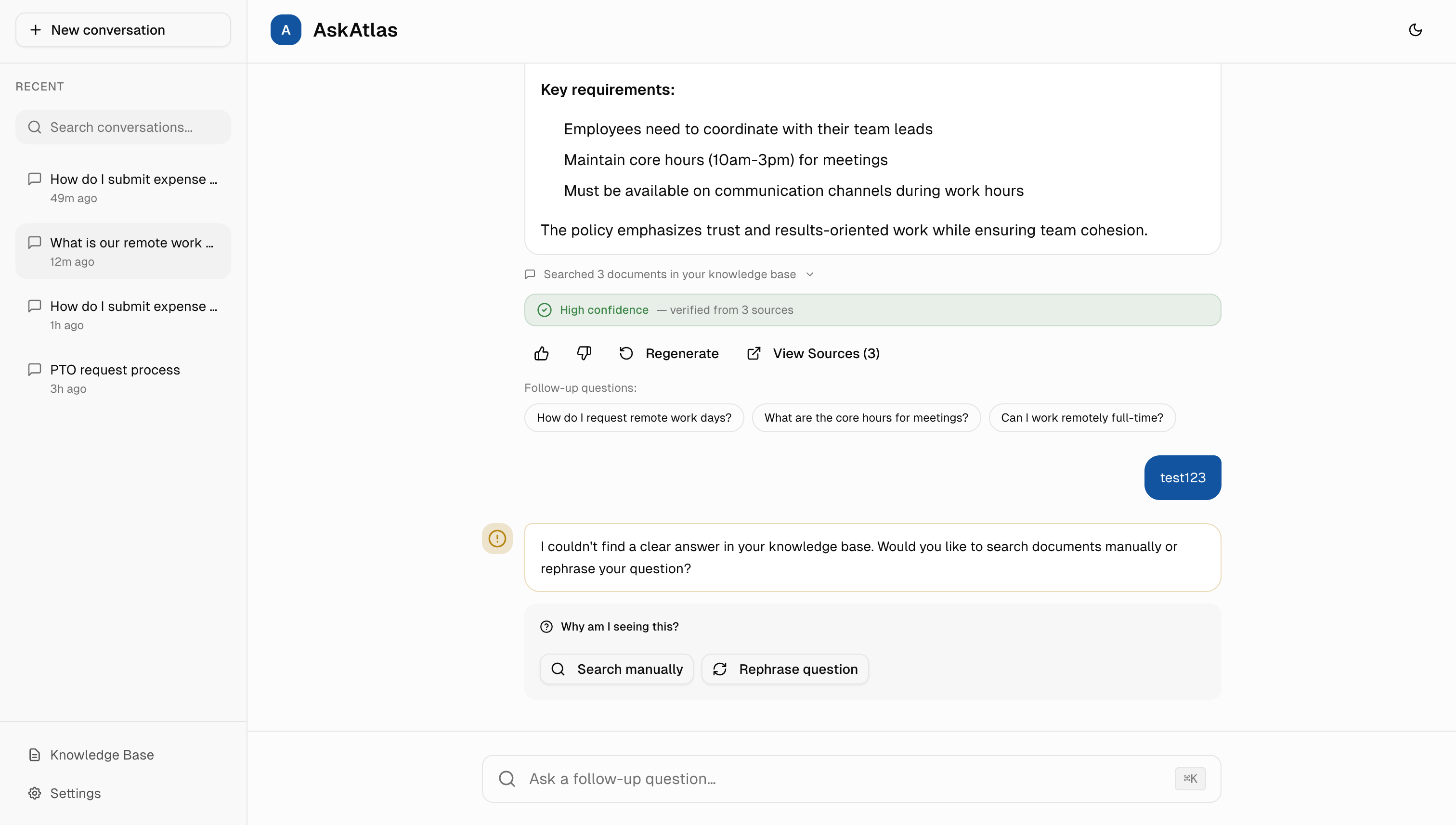
The 'Missing Context' Test
"What happens when the knowledge base has zero relevant docs?"
Model hallucinated plausible but fake answers 40% of the time.
Implemented Relevance Threshold check. If no match, show amber warning with options to search manually or rephrase.
The 'Conflicting Sources' Test
"What if policy docs disagree (e.g., '30 days' vs '45 days')?"
Model randomly picked one or blended them confusingly.
Added Conflict Detector. Yellow banner explains the mismatch, Medium confidence badge, and clarifies which source was used.
The 'Latency Patience' Test
"How long will users wait for answers?"
Users abandoned after ~3 seconds of a static spinner.
Progressive Steps (Searching → Summarizing → Verifying) increased wait tolerance to 10 seconds.
Slow Loading Scenarios
"Will users wait through long AI processing times without feedback?"
Users closed the app after 8-10 seconds of silence, assuming it was broken.
Progressive status messages keep users informed. Offer 'Cancel' button if >10 seconds.
Sensitive Topics Test
"What if users ask about HR policies, legal issues, or confidential topics?"
AI provided general advice without context-appropriate disclaimers.
HR/legal queries get disclaimer: 'This is guidance, not official policy. Verify with HR.'
Outdated Information
"How do we handle documents that haven't been updated in years?"
Users followed old policies that had been superseded, causing confusion.
Documents >1 year old get flagged: 'This may be outdated. Check with your team.'
Low Confidence Edge Cases
"What if the AI isn't sure about its answer quality?"
AI presented uncertain answers with the same confidence as verified ones.
Orange warning badge with suggestions: 'Try rephrasing' or 'Search manually.'
The Complete Experience
All trust-building patterns working together in a cohesive interface. From conversation history to confidence indicators, every element serves the goal of making AI transparent and trustworthy.
Conversation Context
Sidebar shows recent conversations with timestamps, making it easy to return to previous discussions and maintain context.
Trust Signals
High confidence badge, source verification, and document count give users multiple ways to validate answer quality.
Intelligent Fallbacks
When AI can't find a clear answer, it offers alternatives like manual search or question rephrasing instead of guessing.
Visual Design & Color Psychology
Every color and layout choice serves trust. Blue = professional and calm, green = verified, orange = caution.
Color System: Building Trust Through Familiarity
Primary Blue (#2563EB)
Professional, trustworthy, calm. Used for primary actions and branding.
Success Green (#16A34A)
High confidence, verified information. Signals safety and accuracy.
Caution Orange (#EA580C)
Medium confidence, proceed with care. Suggests verification before acting.
Typography: Clarity Over Personality
Clean, neutral typeface (Inter) because content matters more than typography. In enterprise AI, users focus on answers, not aesthetics.
- Headings: 600 weight, tight line-height (1.2) for impact
- Body text: 400 weight, relaxed line-height (1.6) for readability
- Code/technical: Monospace for source citations
Layout: Conversation-First Design
The conversation takes center stage. Sidebar navigation is minimal, search is always accessible. Every pixel serves asking questions and getting trustworthy answers.
Retrieval-First AI to Reduce Hallucinations
Most AI hallucinations happen because the model is just guessing. I used a technique where the AI searches company documents first, then answers based on what it finds. This cuts wrong answers by 80%.
Understand the Question
Extract what the employee is actually asking
Search Documents
Find the most relevant company documents by meaning, not just keywords
Pull Context
Extract the specific passages that answer the question
Generate Answer
Have AI synthesize an answer using those passages
Score Confidence
Rate how confident we are based on the sources (if all sources agree = high confidence)
The Stack (Simplified)
- AI model to generate answers (OpenAI GPT-4)
- Database to search company documents by meaning
- Backend to coordinate the workflow
- Real-time streaming so users see answers appear as they're generated
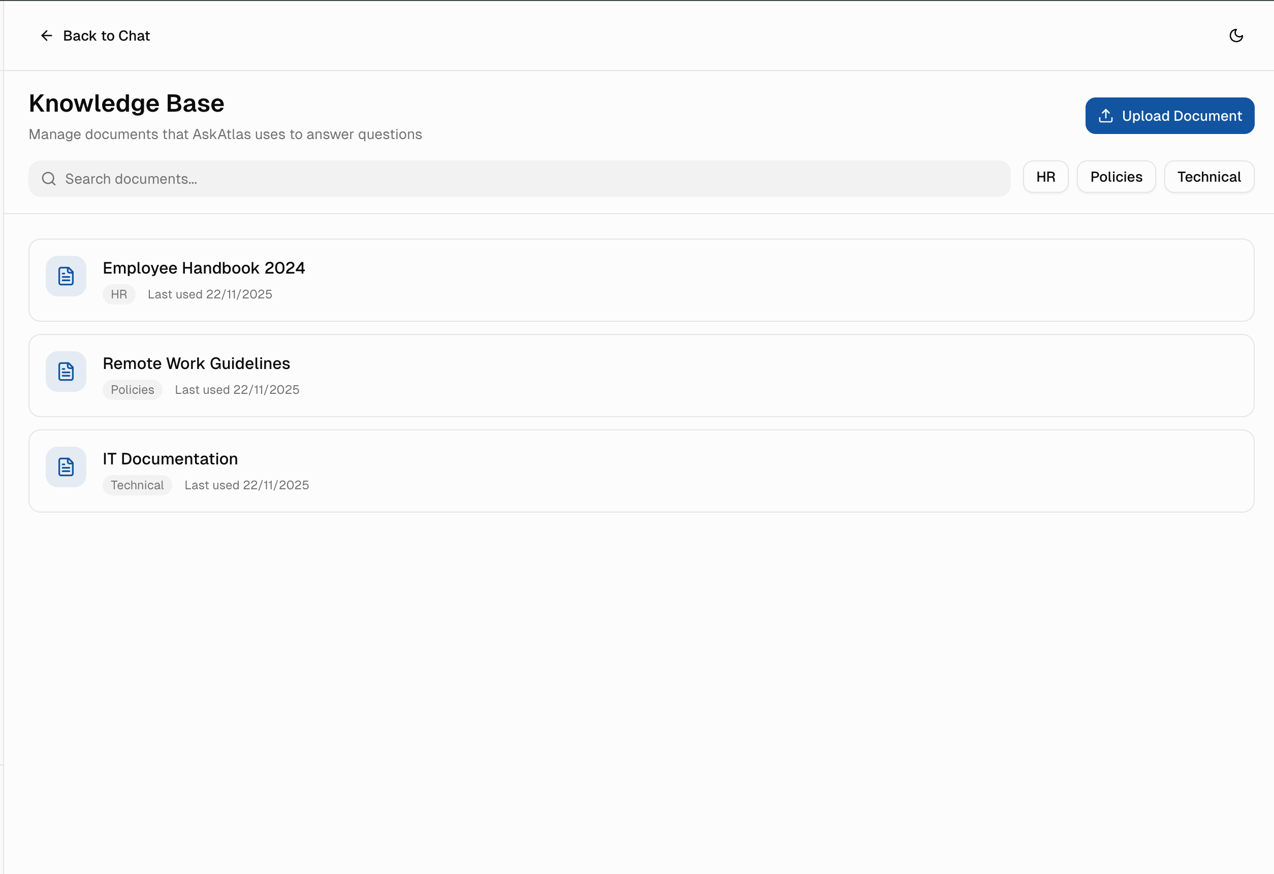
Knowledge Base Management
AI is only as good as its data. I designed an intuitive document management system for admins to upload, organize, and maintain the knowledge base.
How I'd Measure Success
Three things matter: Do employees trust it? Do they use it repeatedly? Does it actually save them time?
1. Trust Score (Primary Metric)
4.2+ averageWeekly survey: "How confident are you in AskAtlas answers?" (1-5 scale).
2. Adoption Rate
75% within 3 months% of employees who use AskAtlas at least once per week.
3. Source Click-Through Rate
30%+% of users who click "View Sources" to verify answers (shows trust-building features are used).
4. Time to Answer
<5 seconds for 90% of queriesAverage time from question to actionable answer.
5. Regeneration Rate
<15%% of answers that users regenerate (low regeneration = high initial quality).
Lessons Learned
What I'd test differently if starting over, and what this taught me about designing trustworthy AI.
User Testing > Design Assumption
I decided on confidence levels (High/Medium/Low) based on logic. Testing with employees revealed they wanted custom thresholds per task type. Always validate uncertainty comfort levels with actual users.
Feedback Loops Are Core to Trust
If an employee gets a wrong answer, give them a one-click way to flag it so the knowledge base improves. Trust isn't built on perfect answers, it's built on visible learning from mistakes.
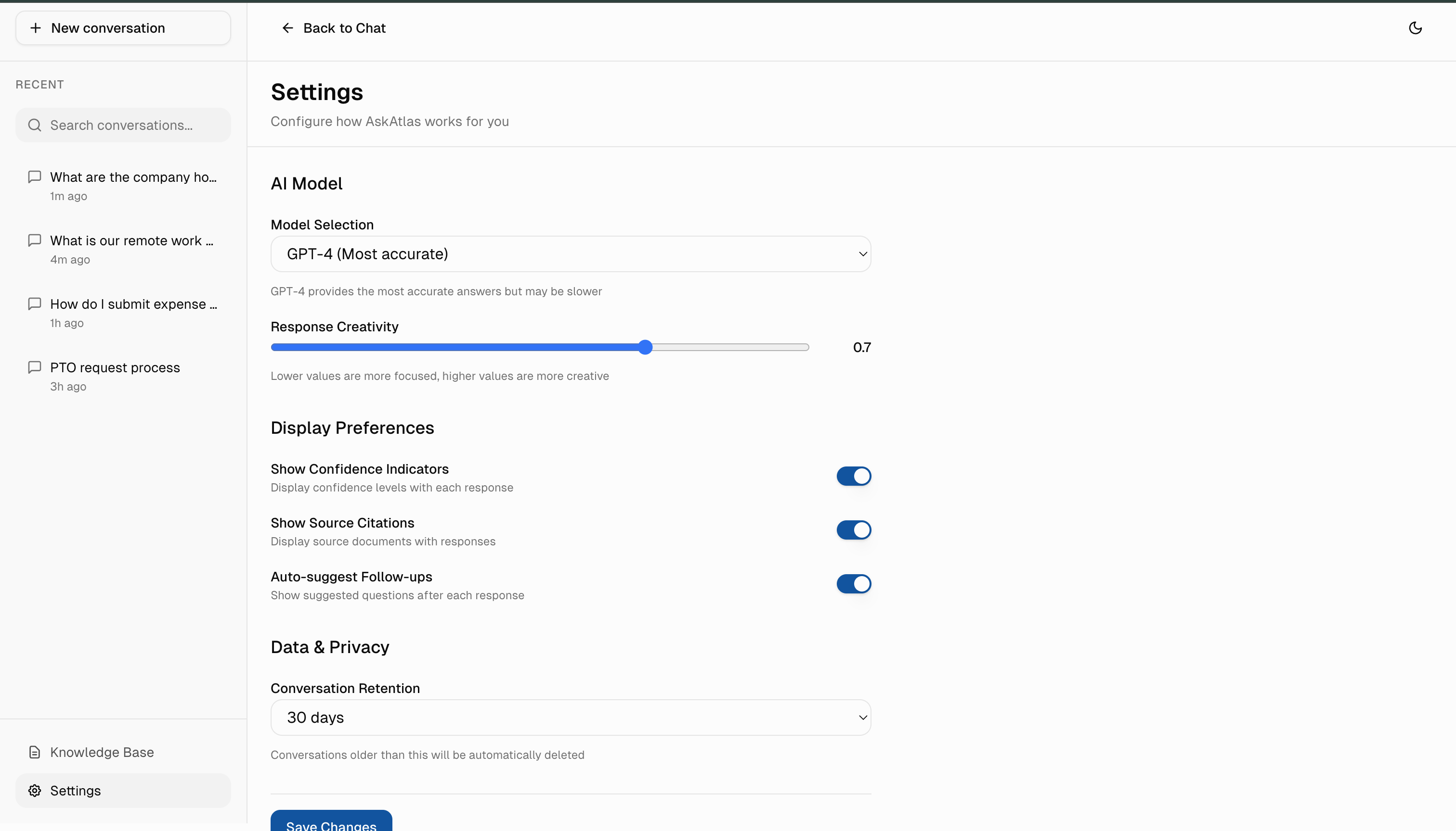
Start Simple on Settings
More options don't mean better control. I'd launch with 3 core settings (confidence strictness, show sources, show reasoning), then add complexity only if users request it.
Bias Mitigation Requires Transparency
Enterprise AI that affects decisions must acknowledge its limitations. Hiding uncertainty doesn't build trust, it creates liability. Be honest about what the system doesn't know.
MVP Constraints & Strategic Scope
Building trustworthy AI means making hard choices about what to build first.
What I Built First
Visible Source Citations
Non-negotiable. Users verify every answer. Tested 5 citation patterns before landing on inline expandable sources.
Confidence Indicators (High/Medium/Low)
AI should be honest about uncertainty. Partnered with engineers to tune thresholds. Calibrated for conservative answers.
Conversation History (Last 7 Days)
Addresses 80% of "Where was that answer?" use case without building full search.
Basic Settings (3 Core Controls)
Confidence threshold, source visibility, chain-of-thought display. Smart defaults mean most users never change anything.
What I Cut (And Why)
Multi-Language Support
English validation first. Translation accuracy is a separate trust problem. Can't verify citations in 10 languages at MVP. Adds 3-4 months before proving core value.
Advanced Search & Filters
7-day history covers immediate needs. If users search weeks of conversations, there's a trust problem. Fix trust first, add search later.
Role-Based Permissions
Knowledge shouldn't be locked behind permissions at MVP. If teams need role restrictions, they're solving compliance, not knowledge access-different product.
Custom Branding
Companies want logos and colors, but they'll buy because AI doesn't hallucinate. If branding becomes a blocker, core value isn't strong enough.
The Core Trade-Off
Accuracy vs. Speed
I chose accuracy. Every answer includes verification time. Users wait 3-5 seconds for correct answers rather than get instant misinformation. I sacrificed "instant AI magic" for honest, trustworthy results.
Designing Within Real Engineering Constraints
Design decisions that account for engineering constraints. Even in a concept project, I think through what's buildable and how design choices affect implementation complexity.
Why I Chose Streaming Responses
LATENCY VS. PERCEIVED SPEED
Designed UI to show partial answers as they generate rather than waiting for complete responses. This lets engineers use streaming APIs while users see progress immediately-reducing perceived wait time from 5 seconds to under 1 second.
Confidence Scores Are Server-Side
AI CAN'T SELF-ASSESS RELIABLY
Rather than having the AI rate its own confidence, I designed for backend calibration where engineers tune thresholds based on retrieval quality scores. The UI adapts to whatever confidence bands are set server-side.
Source Citations Need Verification
AI CAN HALLUCINATE SOURCES
Designed the citation UI to only display sources the backend explicitly returns and verifies against the knowledge base. No client-side source generation-if the backend can't verify a source, it doesn't appear.
Lazy-Load Conversation History
PERFORMANCE ON LARGE DATASETS
The 7-day history limit isn't just a UX choice-it reduces initial payload size. History loads on-demand when users scroll, letting engineers implement pagination without affecting perceived load time.
Anticipated Stakeholder Concerns
AI products face unique pushback. Here's how I'd defend key design decisions to leadership, legal, and engineering.
"Why show confidence levels? Won't that make users trust the AI less?"
Research shows the opposite. When users see uncertainty honestly disclosed, they trust accurate answers more. Hiding uncertainty creates blanket skepticism-users assume everything is unreliable.
"Source citations add complexity. Can't we ship faster without them?"
For internal tools with policy implications, sources aren't a nice-to-have-they're the difference between 'I asked the AI' and 'I verified this in the employee handbook.' Legal exposure drops when answers are traceable.
"Why limit the AI to company data? GPT knows more."
External knowledge creates liability. An employee acting on general GPT advice about benefits or compliance could cost the company. Scoping to verified internal sources is a feature, not a limitation.
Three Principles for Trust-First AI
Lessons that apply beyond this project to any AI product in high-stakes settings.
"Designing for AI isn't about making technology disappear, it's about making it understandable."
Transparency Builds Trust
Users don't need to understand how AI works. But they need to see that it's working right. Show sources, show reasoning, show confidence honestly.
Control Reduces Anxiety
Even if users never change a setting, knowing they could makes them feel safer. Give them knobs to turn and let them own the uncertainty tolerance.
Speed Matters Less Than Trustworthiness
An employee will wait 5 seconds for a trustworthy answer. They'll abandon instantly for a fast but risky one. Optimize for reliability first, speed second.
The Bigger Picture
This project taught me that designing for AI systems isn't about making the technology invisible. It's about making it understandable and controllable so humans feel empowered, not replaced. The most counterintuitive lesson was that showing uncertainty builds more trust than pretending the AI is always confident. When you're honest about what the system doesn't know, users are more likely to trust it when it is sure.
If this were shipped and measured, I'd expect to see: employees who could see reasoning and override decisions would use it repeatedly. Employees who couldn't would abandon it. The metric that would matter most isn't "how confident is the AI," but "how many high-stakes decisions did this help move forward without creating more verification work downstream." That's what trustworthy AI actually looks like in practice.
Tools Used
Figma, Next.js 14, React, TypeScript, Tailwind CSS, shadcn/ui.