What If Capturing Design Decisions Took 30 Seconds?
I forget half my design decisions by month's end. So I built a voice-first app that turns speech into structured memory cards. Shipped in 3 days while working full-time.
TL;DR
I built Recall to solve my own problem: I forget the decisions I make at work within weeks. The friction of opening Notion and typing killed my motivation to document anything. Recall uses voice + AI extraction to make logging a 30-second habit instead of a 10-minute chore.
Three days from concept to shipped product, built entirely with Claude, v0, and Cursor while working full-time. Currently using it daily. Went from logging 3 decisions per month to 20.
Role & Responsibilities
- Product Strategy & Scoping
- UI/UX Design
- Visual Design & Animation
- Frontend Implementation
- AI Prompt Engineering
Solo project shipped in 3 days while working full-time. Built with Claude, v0, and Cursor.
Project Goal
Create a frictionless way to capture design decisions in the moment, using voice input and AI extraction to turn 30-second speech into structured memory cards.
I Have Goldfish Memory
By the end of the month, I've forgotten half the decisions I made at work. Why I pushed back on using a modal. What edge case I caught in the approval flow. The specific reasoning behind choosing a drawer over a dropdown.
When performance reviews come around or I'm updating my portfolio, I'm scrambling. I know I did good work, but I can't remember the specifics.
The problem isn't wanting to document my thinking. It's the friction. Opening Notion, creating a document, deciding on structure, typing everything out. By the time I'd do all that, the moment's gone. The decision to log something happens in a 30-second window right after a meeting. If I don't capture it then, I won't.
I tried voice memos. Ended up with 47 unlabeled files I never listened to. I tried Apple Notes. Unstructured chaos. I tried Notion. Logged 3 things per month when I remembered.
The insight: friction isn't in storage, it's in capture. Voice removes typing, but voice alone creates a different mess. I need structure to happen automatically.
What I Built
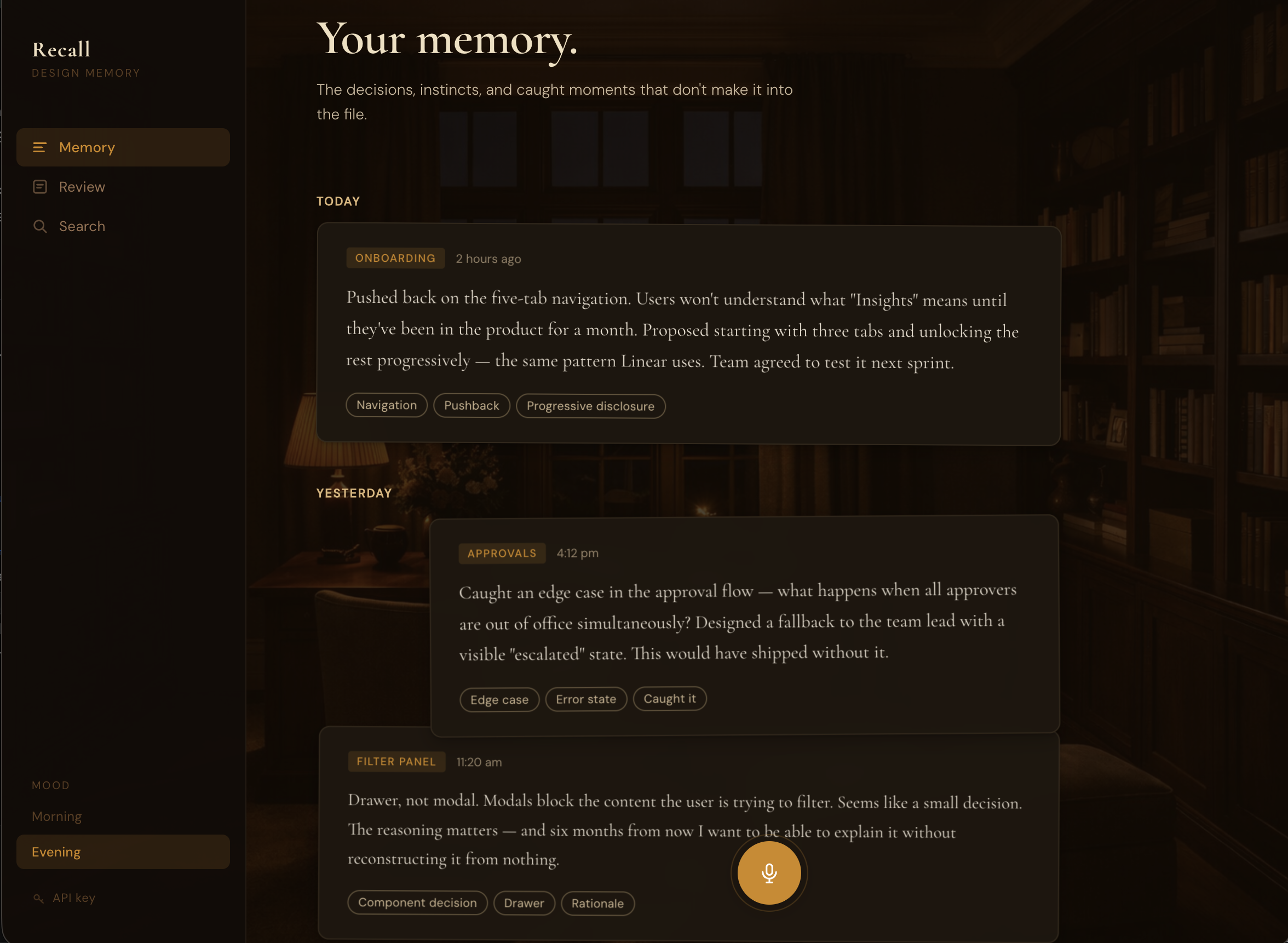
Recall turns 30 seconds of speaking into a structured memory card.
The flow: Click mic, speak your decision, review transcript, save, done.
Claude API extracts the structure: category (DECISION, PUSHBACK, OBSERVATION, EDGE_CASE, RATIONALE), one-line statement, context, tags. No typing, no formatting, no manual organization.
Two modes match when I actually log: Morning for intention-setting (what am I tackling today?), Evening for reflection (what did I learn?). Same private study, different lighting. Golden hour versus amber lamplight.
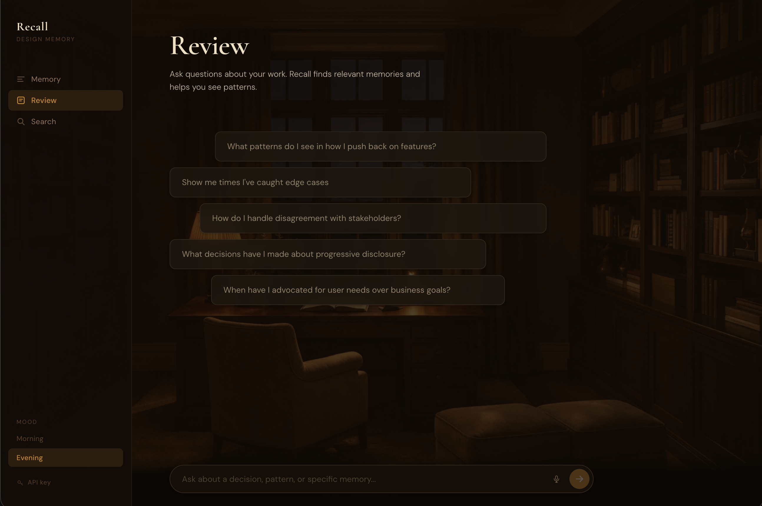
The Review feature lets me ask questions about patterns. "What pushbacks have I made recently?" pulls specific examples with dates and synthesizes patterns I wouldn't see on my own. Turns passive archive into active intelligence.
How I Built This (3 Days, Full-Time Job)
Day 1: Product decisions
I started with three moods: Morning, Evening, Garden. Garden had a botanical aesthetic. Looked nice in mockups.
I asked myself (and Claude): when would I actually choose Garden? What workflow does it support? I couldn't answer. "It feels complete" isn't product rationale. Cut it.
Same logic killed the coaching feature. An AI layer that would critique decisions after logging them. Sounds useful, but coaching requires full context. A 60-second voice note doesn't give enough. Bad coaching is worse than no coaching.
For the AI model, I needed to articulate what the extraction task actually required: short focused input (30-60 seconds), structured output (categories and tags), fast response (2-3 seconds). Sonnet's extra intelligence helps with ambiguous long-form content. For clear short input where I've already organized my thoughts verbally, Haiku's speed matters more. Chose Haiku.
These weren't Claude telling me what to do. I used it to pressure-test whether I could defend my own decisions. If I can't articulate why something should exist, it shouldn't.
Day 2: Visual design
I gave v0 reference sites for direction: In Common With (typographic restraint, warm cream and burgundy), Pooky (richness without decoration).
First iteration came back with gradient-heavy cards. Generic. Every AI design tool produces gradients.
I described what I wanted: room as atmosphere, not identifiable furniture. Photographic study environment with warm overlay. The room should provide warmth and light direction without competing with the UI.
v0 generated versions with different overlay opacities. I iterated until the room read as a subtle wash instead of a visible photograph. Too light (0.5 opacity) and the room becomes distracting. Too heavy (0.95) and it disappears entirely. Sweet spot: 0.72-0.88 depending on mood. You sense warmth without identifying objects.
That 0.15 opacity difference separates atmospheric from distracting.
The stacked desk concept came from wanting cards to feel hand-placed, not machine-aligned. Cards overlap slightly (negative top margin), each with subtle alternating rotation (plus or minus 0.4deg). Three shadow layers per card create depth. Single shadows look flat.
Decision and pushback cards span full width. Observations and edge cases are 85% width, right-aligned. The width gives you shape information before reading. Wide = significant moment. Narrower = note or observation.
Day 3: Building and shipping
Cursor and Claude Code handled implementation: Web Speech API integration, Claude API extraction, React state, card animations, deployment.
The workflow: describe what needs to happen (or what feels wrong), code gets written, test, iterate. No context switching to documentation or Stack Overflow.
Making Cards Feel Physical
Initial implementation: cards faded in with simple opacity transition. Worked, but felt lifeless.
I wanted cards to feel like someone placing note cards on a desk one at a time. Described to Claude Code: cards should drop from higher, settle with a slight bounce, stagger slow enough to see each one land.
Result: 40px drop distance, bounce easing with overshoot, 100ms stagger, rotation settle from 3deg to plus or minus 0.4deg. Now cards feel like they have weight. The bounce creates that satisfying "thunk" when something lands.
Tested stagger timing: 50ms felt like a batch drop, 150ms felt laggy, 100ms hit the sweet spot.
Hover lifts cards 12px off the stack, straightens rotation to 0deg, intensifies shadow significantly. The shadow intensification sells the lift. Without it, translateY just looks like sliding up the page. With strong shadow increase, it looks like the card moves toward you in 3D space.
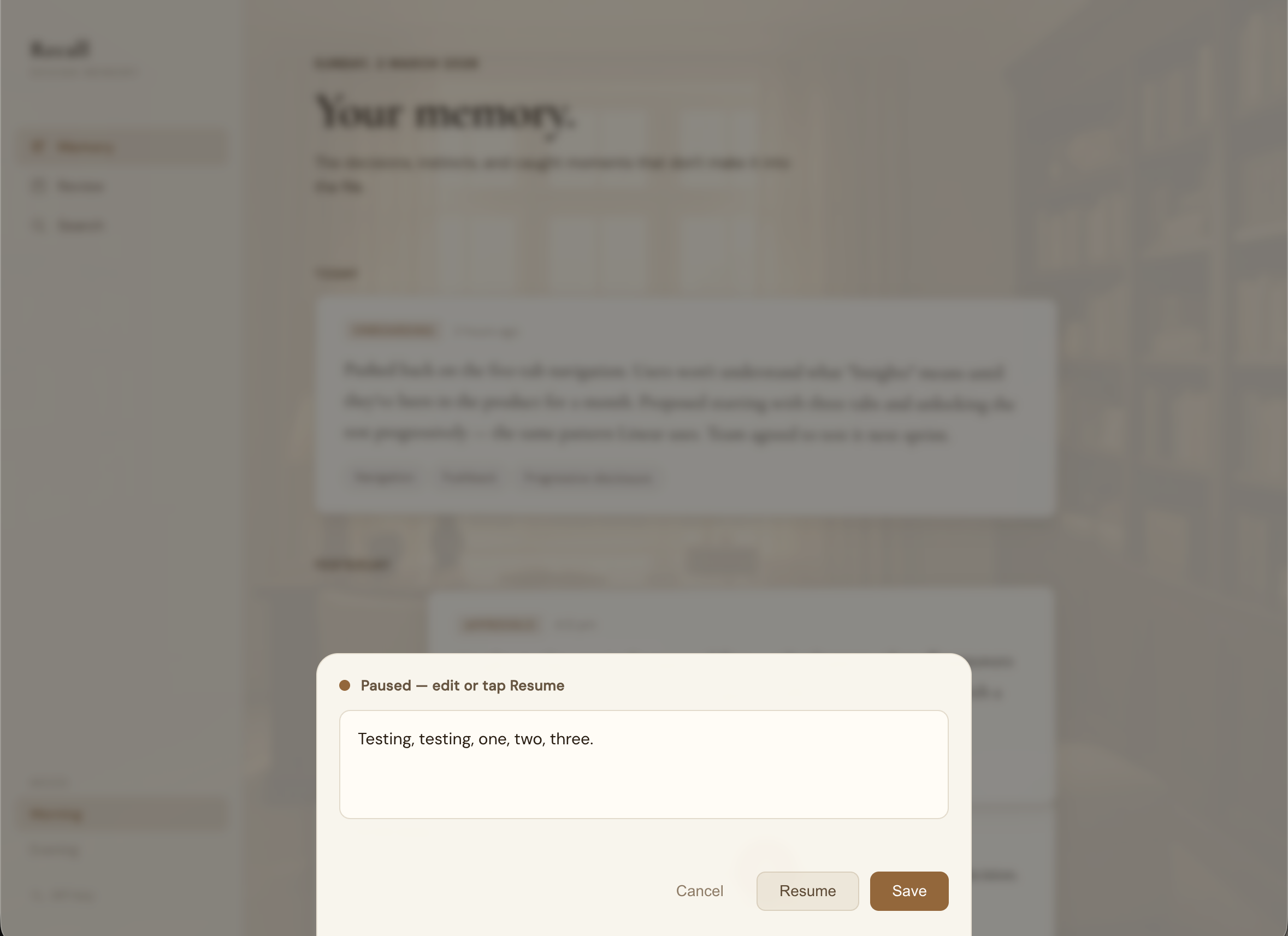
When Speech Recognition Fights You
Web Speech API stops listening after detecting silence (1-2 seconds). I'd pause mid-sentence to think and it would auto-submit incomplete thoughts. Or I'd take a breath between sentences and lose the rest.
Tried increasing the silence threshold. Didn't work. Browsers handle this differently, and pauses between thoughts would still trigger submission.
Solution: show transcript in an editable modal after speech ends. I control when to submit, not the silence detection. Added "Resume recording" if I want to add more after reviewing.
This fixed two problems: I can fix transcription errors (my accent means "drawer" becomes "draw"), and I decide when I'm done speaking.
Cards That Looked Like Floating Glass
Initial cards used high backdrop blur (20px) and low opacity (0.85-0.92). They looked like frosted glass hovering in space. Not the physical paper-on-desk feeling I wanted.
Fixed by reducing blur (20px to 8px), increasing opacity (0.96 Morning, 0.97 Evening), and strengthening the background overlay. Cards now read as solid material with subtle depth, not translucent panels.
Frosted glass was a 2020 design trend. Solid paper with subtle blur is timeless.
What Changed After Building This
Before: 3 decisions logged per month in Notion when I remembered.
After (2 months): 40+ memories captured. 20 per month. 13x increase.
The behavior change happened because the cost dropped from 5-10 minutes (structure + typing) to 30 seconds (speak + save).
Real use: Interview prep
Had an interview, needed examples of pushing back on features. Asked Review: "Show me times I've pushed back on product decisions."
Got three specific examples with dates and context. Examples I'd completely forgotten. Turned "I think I do this?" into "here's exactly when and why, three times."
Real use: Portfolio research
When writing case studies, I pulled all DECISION and PUSHBACK memories from six months. Found patterns: I consistently push back on features lacking user validation. My edge case catches cluster around approval flows and empty states. I prioritize clarity over simplicity when they conflict.
This became my portfolio framing: designer who validates assumptions, catches edge cases early, advocates for clarity. Without Recall, I'd have said "detail-oriented" and called it a day.
The Difference Between Good and Great
Shadow layering. Easing curves. Overlay opacity. Spacing relationships.
Morning cards use three shadow layers: close (1px, subtle), medium (4px), far (8px). The layering creates realistic depth. Single shadows look flat.
The bounce easing uses cubic-bezier with slight overshoot. Linear easing feels mechanical. The overshoot creates settling, like dropping something that bounces once before resting.
The room overlay at 0.75 opacity versus 0.88 opacity changes everything. 0.75 lets you see furniture details. 0.88 gives you warmth without identifying objects. That's 0.13 opacity separating atmospheric from distracting.
These aren't decoration. They're the difference between premium and generic.
What I'd Do Differently
Start mobile-responsive from day one. The "quick capture throughout the day" use case is mobile-first, but I built desktop-first because that's where I design. Should have thought about actual usage context earlier.
What's Next
- •Search (text + filter by category/tag/date)
- •Persistent Review conversations (currently session-only)
- •Memory linking (connect related decisions)
- •Spiral timeline view (recent entries at outer edge, oldest toward center)
- •Mobile optimization (voice works but UI needs responsive fixes)
Why This Matters
When iteration cost is low, you explore more. Traditional development makes trying things expensive, so you commit early to fewer options. With Claude Code, "this animation feels flat" becomes implemented bounce easing in minutes, not hours. That freedom changes what you're willing to try.
The main value isn't speed (though 3 days is fast). It's that you can be more experimental when testing an idea costs seconds instead of hours.